

MellowCao
Reiki Responsive Website
My Role: UX/UI Designer
Time: 2023
About the Project
MellowCao Reiki wants a responsive website to introduce those who are looking for holistic healing about Reiki, its benefits, and provide services.
The Problem
Balancing clear information and easy-to-use design to effectively share Reiki ideas and services on different devices, meeting accessibility and engagement needs.
The Solution
Designing a responsive website with an easy-to-use interface that focuses on what users need. It will have simple navigation and attractive visuals to share info about Reiki and its benefits on any device.
Design Process:
-
*Understand why users explore holistic well-being.
*Find out the challenges users encounter when trying to include Reiki in their lives.
*Look into what users prefer in website content, features, and community engagement.
-
Sorting through gathered information, recognizing patterns, and defining the design challenge to guide the next steps in the process.
-
Brainstorming, sketching, and creative thinking.
-
Finally, gather user feedback and refine solutions iteratively.
User Research Methods
Online Surveys: Question users about Reiki use, experience, and challenges.
User Interviews: Talk to diverse users about their Reiki experiences.
Usability Testing: Observe users doing tasks on the site, collect feedback.
User Survey
I created a survey to find out what people think about Reiki and holistic healing, and if they're open to spiritual practices for healing. To see the full survey click here.
100%
User Interviews
I interviewed 3 users to see how they feel about reiki, if they're interested, what they want on a website, and how they navigate it. For the full interviews click here.
“I would not want to see something like, oh, this is for everybody. It'll heal everyone. No, nothing is for everybody. There's only certain things for certain people. And so I guess I'd want to see who their target people are and see if I would be one of them.”
-User Participant 1
I'm always open to try new things. Just keep my mind open. You never know what new experiences could lead to you.
-User Participant 2
I would expect to find some information about what Reiki is and what it does, what a session includes. I would also expect to find more about the practitioner or Reiki master's background. Definitely links to be able to book sessions and work calls, to learn more about consultation calls, maybe if necessary. And yeah, maybe a frequently asked questions page, contact form, testimonials reviews on that specific practitioner.
-User Participant 3
58%
54%
identify as spiritual/open minded.
are unfamiliar with Reiki.
expect a beginner friendly website.
HMW (How Might We) Statements:
HMW make a Reiki website, especially those new to Reiki, about its benefits and practices?
HMW improve the user experience on the Reiki website for beginners, making it easy to find information?
HMW offer resources on consistency, anxiety, modality selection, self-doubt, and relapses?
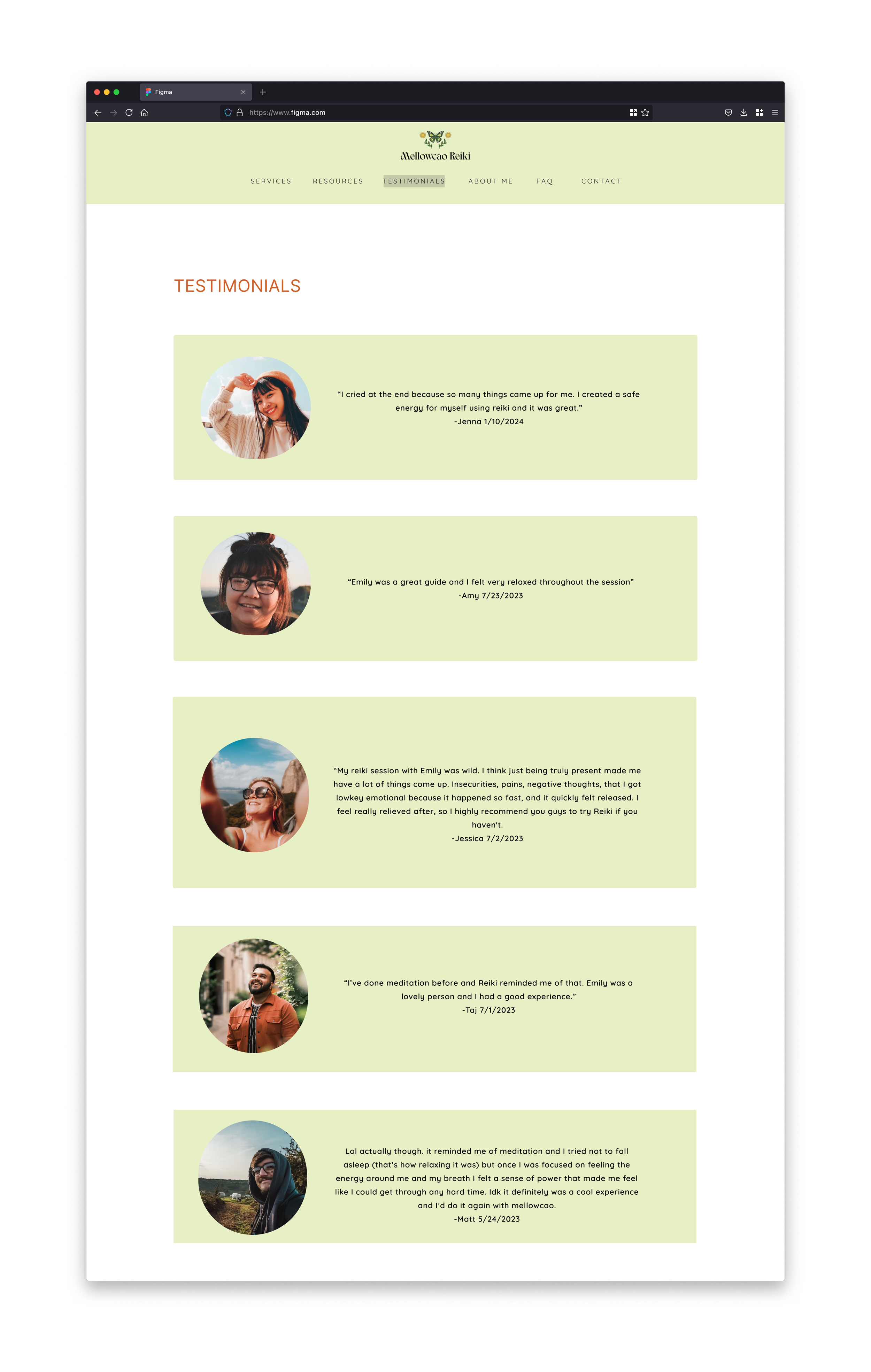
Solution: Show testimonials, provide FAQ for questions.
Solution: Clear navigation, User-Friendly language, and a responsive design.
Solution: Services provided with Reiki Practitioner. Having intentions set before going in session.
Information Architecture
Site Map:
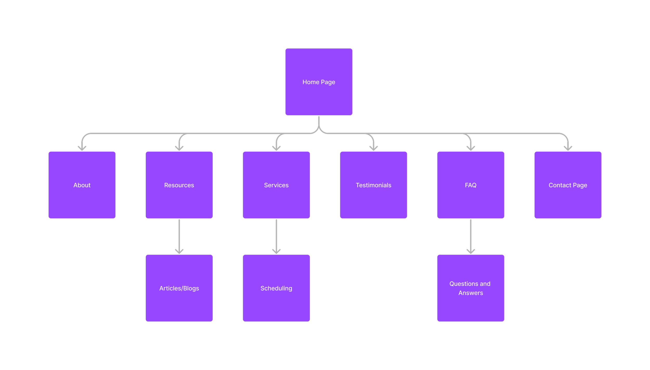
I arranged the website's content for easy navigation and priority before designing it, so I know what needs to be included.
Flow Chart:
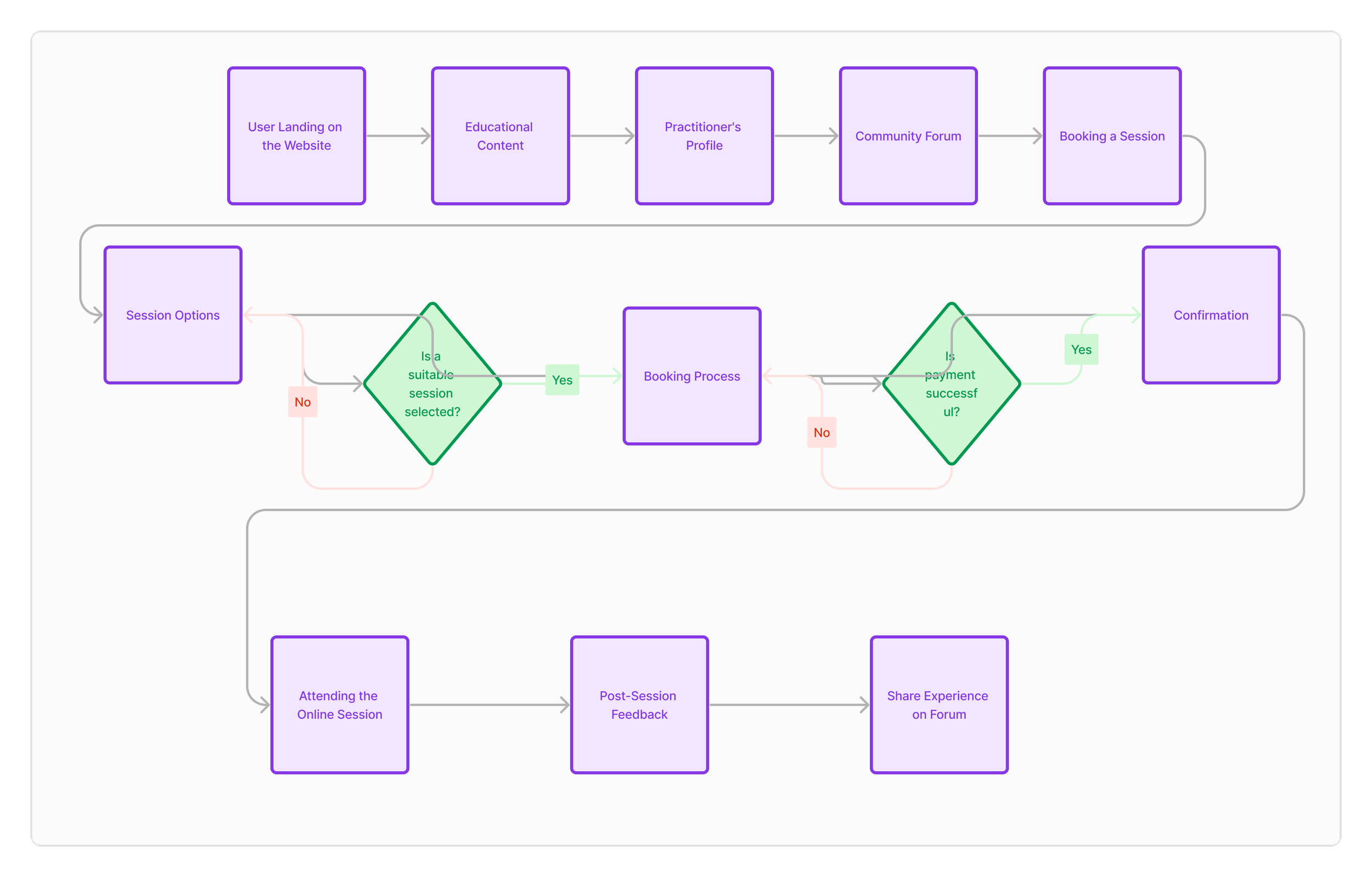
Simple flow chart of a user landing on the website page and ultimately books a session and shares feedback at the end.
Low Fidelity Sketches
Desktop:
Mobile:
The basic design is simple, allowing users to go from the home page to other pages with easy forms. I'm skipping the medium design stage and going straight to the detailed design because I already have a clear vision from the basic design.
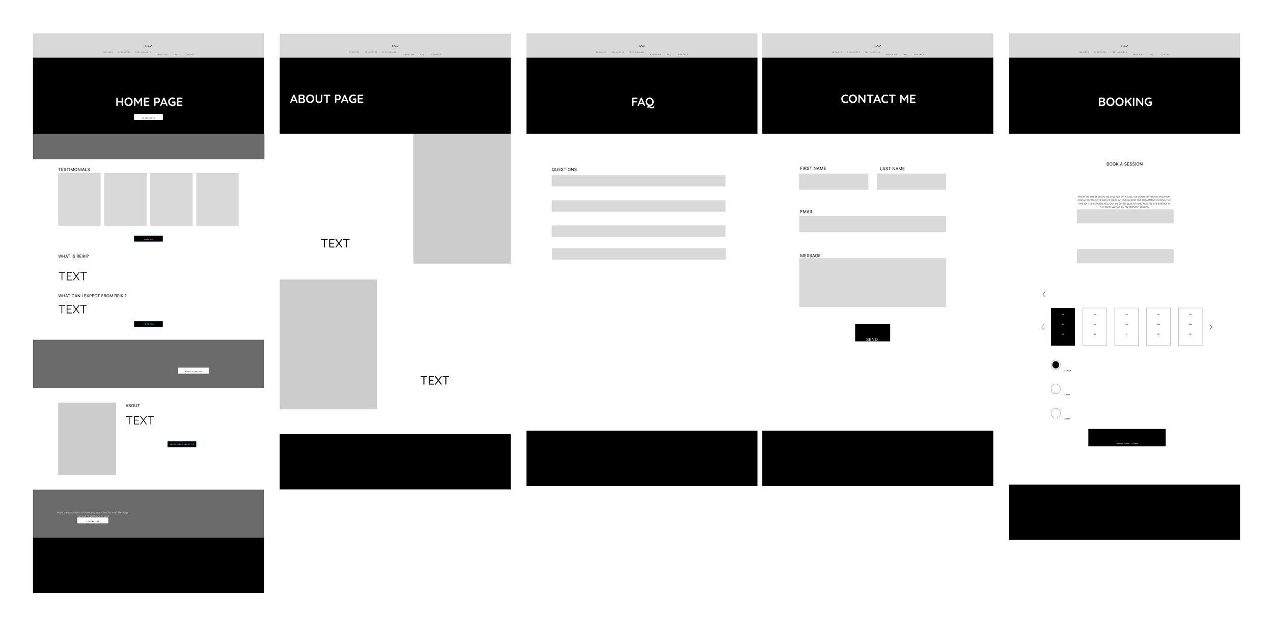
High Fidelity Wireframes
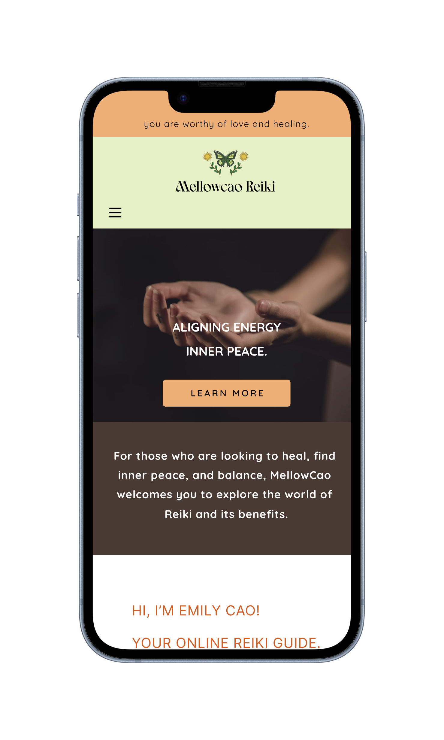
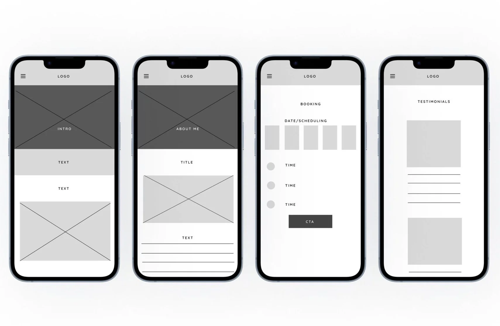
Desktop
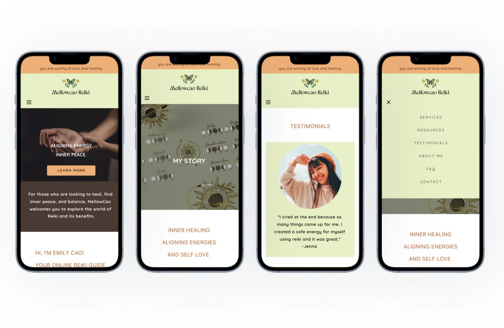
Mobile
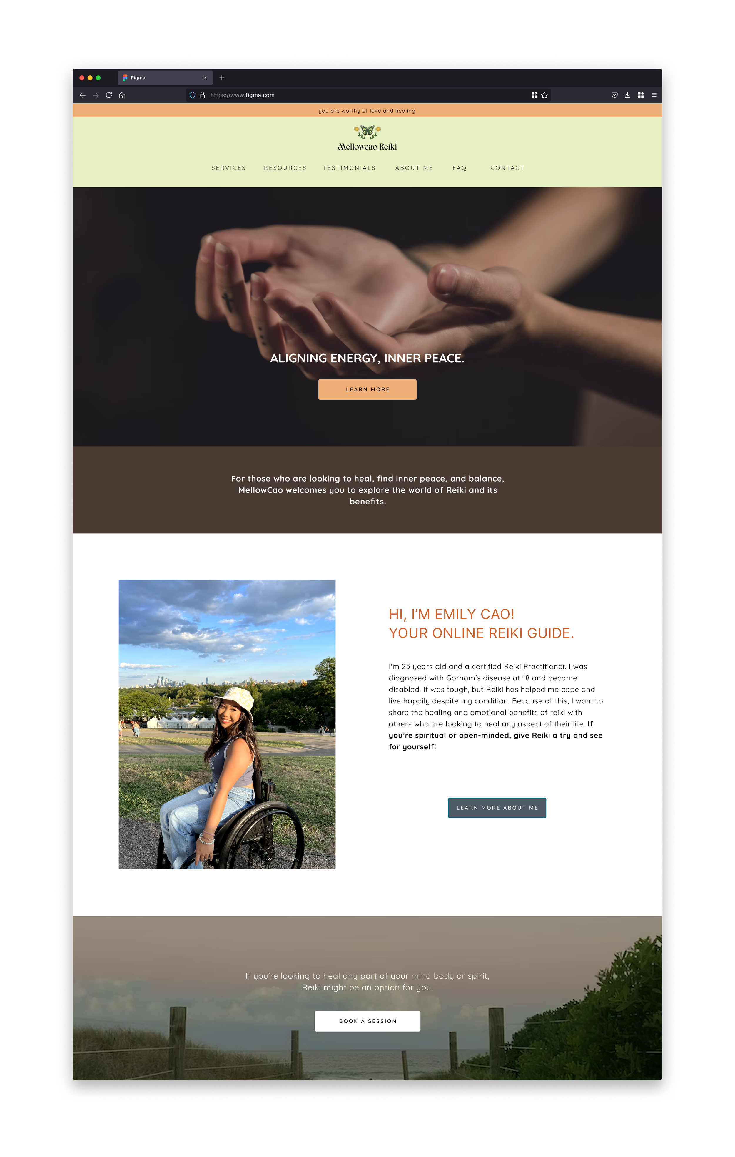
I stuck with light colors using green, orange, and brown because I wanted convey specific energies and create a harmonious and balanced atmosphere.
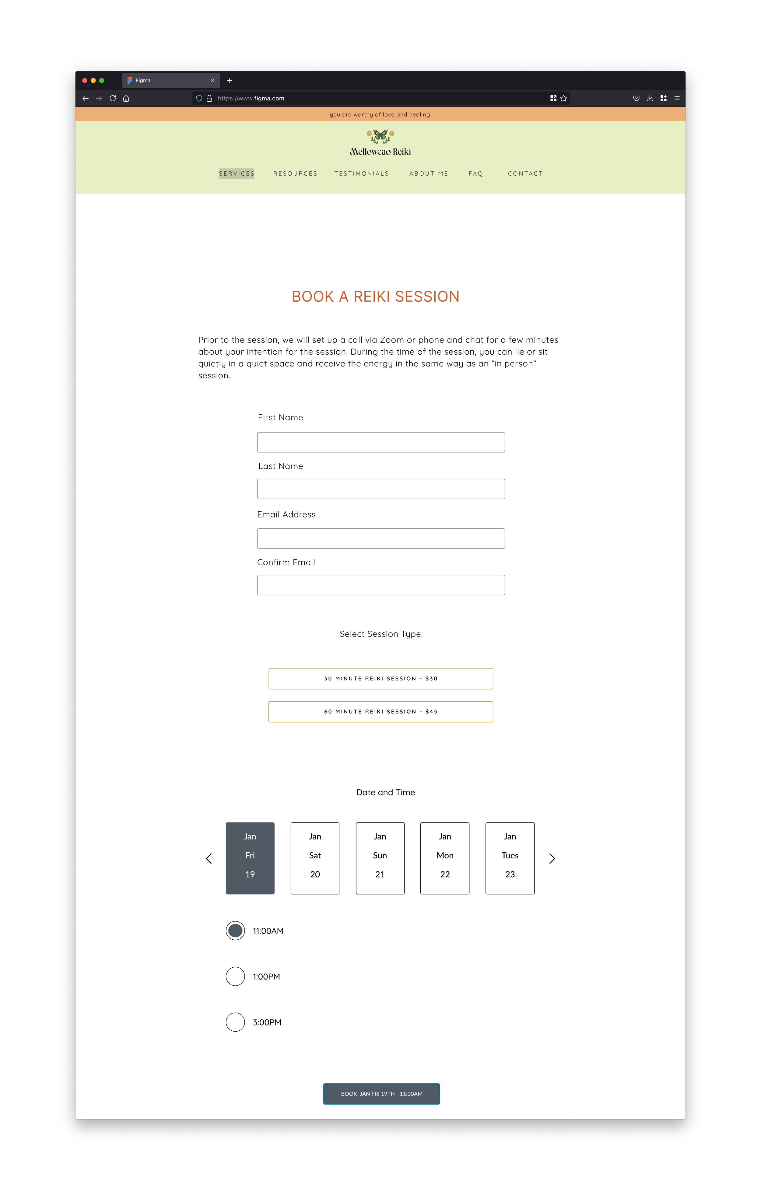
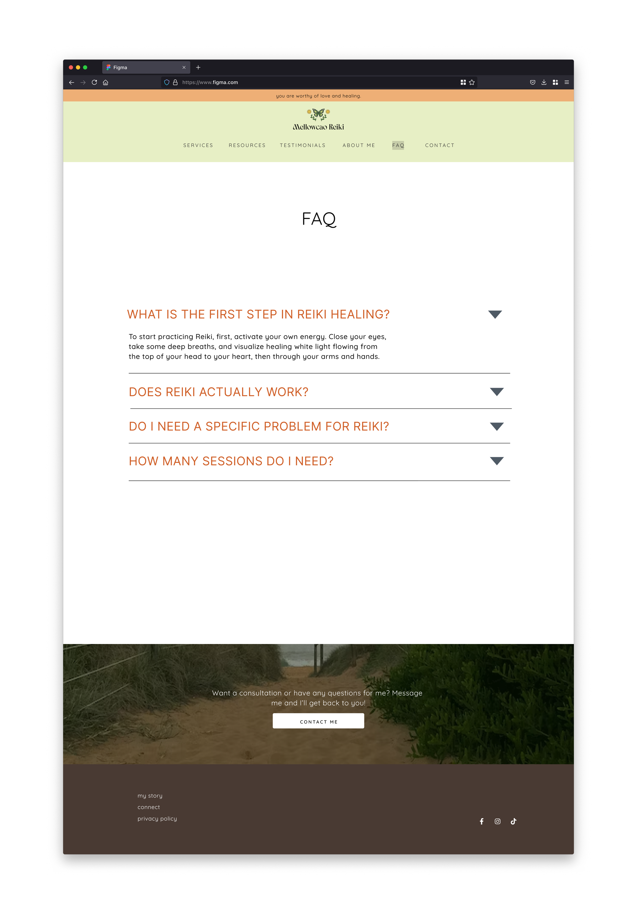
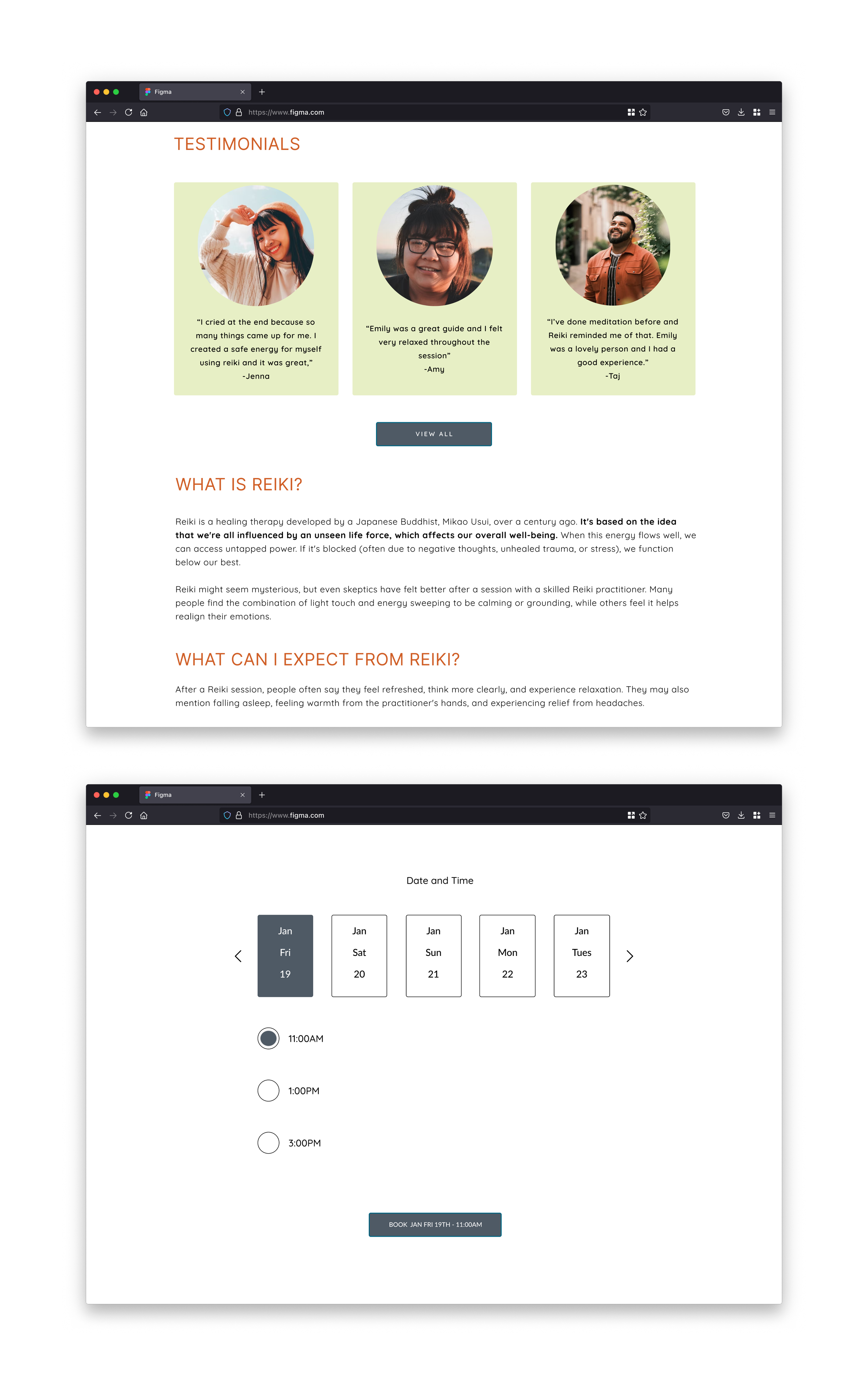
Prototype and Usability Testing
Desktop
Mobile
After testing the desktop and mobile prototypes, I made necessary changes based on the feedback.
Iterations
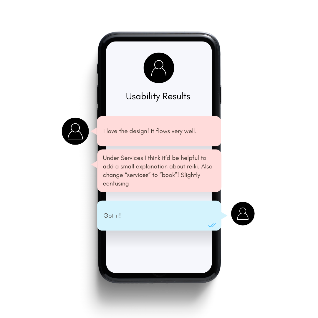
I tried the first prototype with 3 users to see what changes are needed to make the experience easier and more enjoyable. They tried to book a session, and I want to know if they now have more information than before visiting the website. Here are some key points.

100% of users were able to complete their task.

100% of users were able to understand what Reiki was.
80% of users found the website simple and intuitive.
Issues found during testing and fixed in the update:
Users found the highlighted navigation hard to see.
Solution: Changed the highlight to a brighter color.
Users requested the navigation to be reordered differently by priority
Solution: Reordered and prioritized navigation.
Users desired more information on Reiki.
Solution: Included additional information about Reiki on the booking page.
Key Lesson:
I learned that a design can be simple and impactful when done right. I had a previous design for this Reiki Website and made a lot of iterations from the before website to after. This one looks more polished and professional despite having less graphics and overall I feel is a better uncluttered design.