

InstaConnect
A feature add distraction free chat app for IG users.
My Role: UX/UI Designer
Time: 2023
Project Overview:
Introducing InstaConnect, a simple chat app made for Instagram users. It offers a clean and focused experience, free from ads and unnecessary posts. Stay connected and boost your productivity effortlessly.
The Problem
Instagram's addictive nature and distractions hinder productivity, posing a challenge for focused communication.
The Solution
InstaConnect aims to solve the problem of distraction on Instagram by providing a focused chat app, allowing users to connect with friends without the clutter of ads and posts.
Design Process
-
Talking to users, watching how they act, and understanding what they need and care about.
-
Sorting through gathered information, recognizing patterns, and defining the design challenge to guide the next steps in the process.
-
Brainstorming, sketching, and creative thinking.
-
Finally, gather user feedback and refine solutions iteratively.
Design Goal
Develop InstaConnect, a user-friendly messaging platform for Instagram, designed to enhance focus and productivity by eliminating distractions and delivering a seamless communication experience.
User Research
The goal is to review research results to find important points and come up with ideas for future actions.
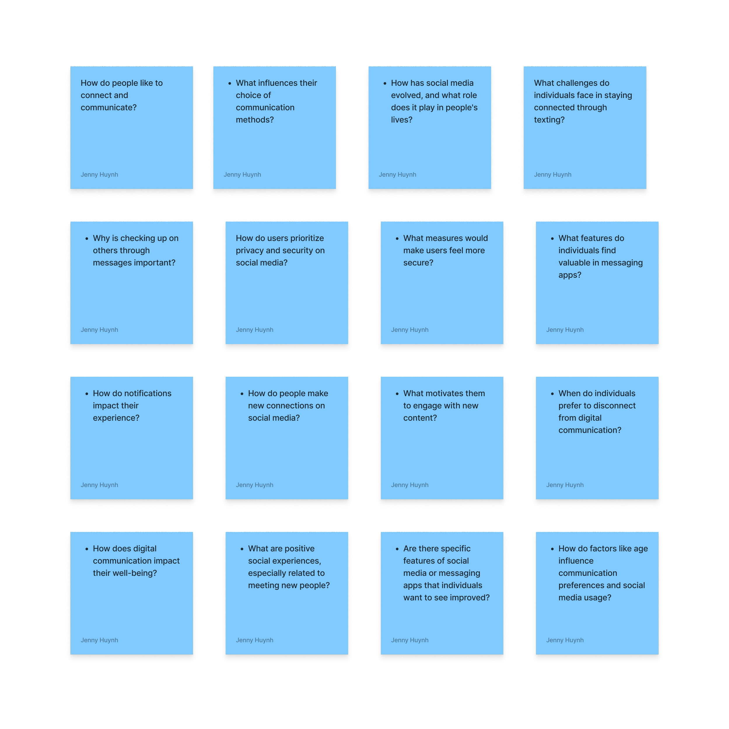
Research Questions
Key Findings:
Users generally spend 4-7 hours daily on their phones, preferring texting for communication.
Instagram is the favored platform for staying connected, with regular checks on stories and messages.
Challenges include managing screen time and concerns about privacy and data tracking.
Users value genuine connections, recognizing the need to disconnect for personal well-being.
Suggestions for improvement include better content control, personalized feeds, and enhanced privacy features on Instagram.
Conducting User Interviews
I interviewed 4 users to get an understanding of their preference for communication and applications on their phones. I wanted to see whether or not they had pain points so I can continue to conduct further research. For full interviews click here:
Conducting User Surveys
I undertook a brief survey on my Instagram platform to gather insights and gauge respondents' perspectives on the survey questions.
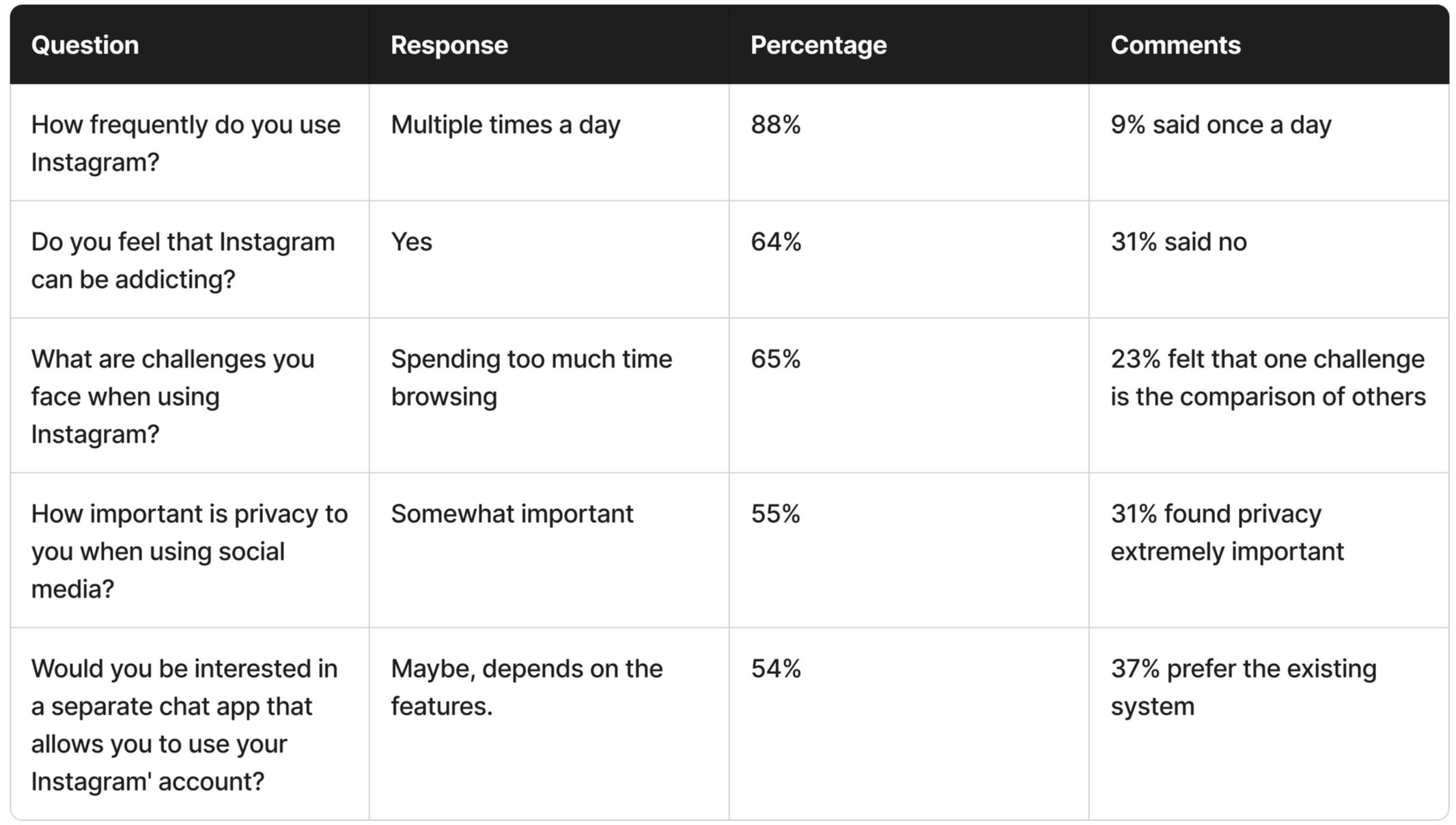
Summary:
Active Instagram users feel addicted to excessive scrolling, varying privacy importance. Interest in integrated chat app for private communication with desired features alongside current messaging system.
Competitive Analysis
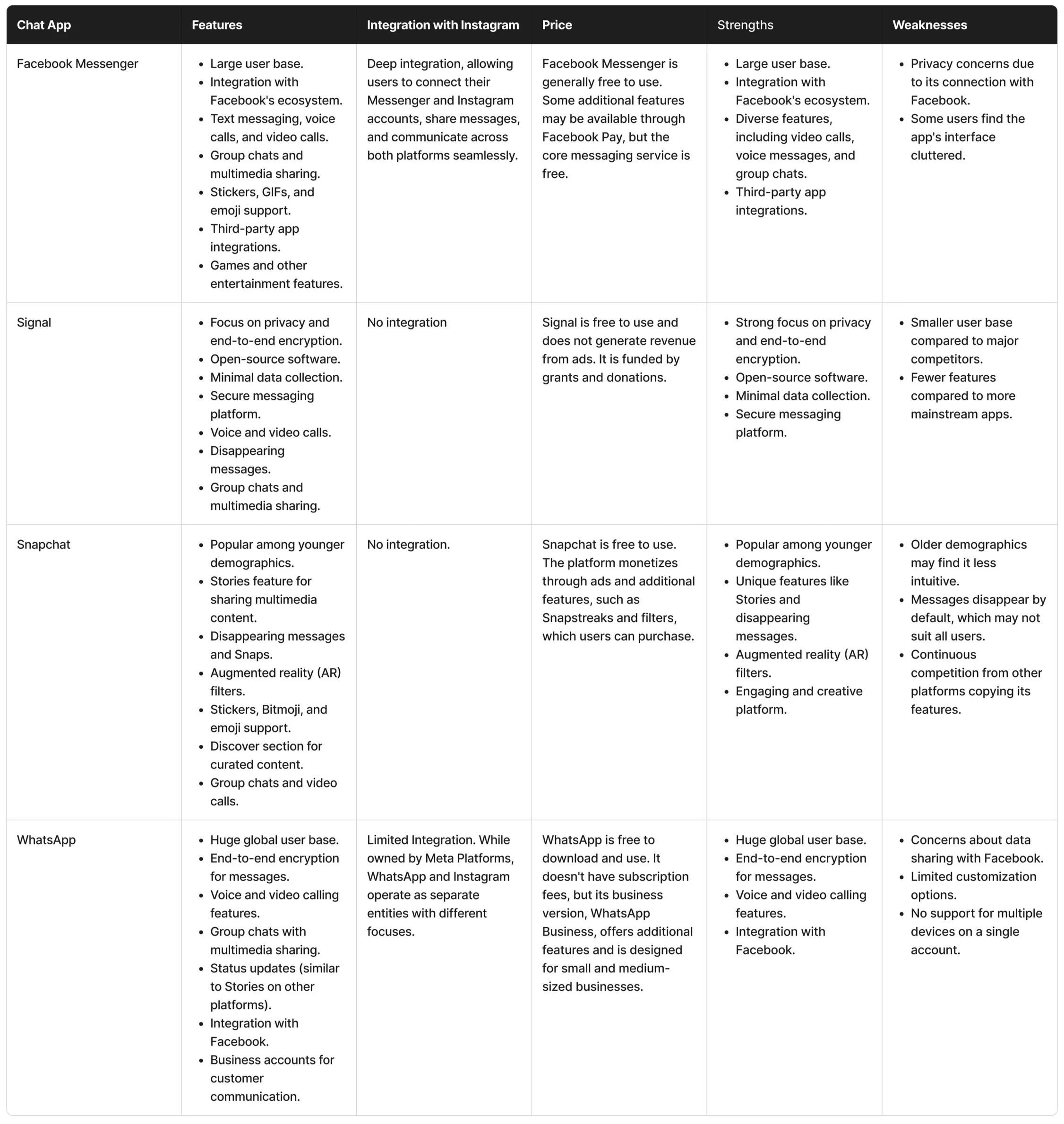
I selected Facebook Messenger, Signal Private Messaging, Snapchat, and WhatsApp as competitors due to their diverse features facilitating private connections and messaging. These platforms boast a dedicated user base and currently stand out as popular choices.
Summary:
InstaConnect can enhance user experience with privacy-focused design, familiar Instagram DM layout, added video calls, improved message organization, multimedia features, global reach, encryption, business integration, and entertaining elements from competitors like Signal, WhatsApp, Facebook Messenger, and Snapchat.
Define
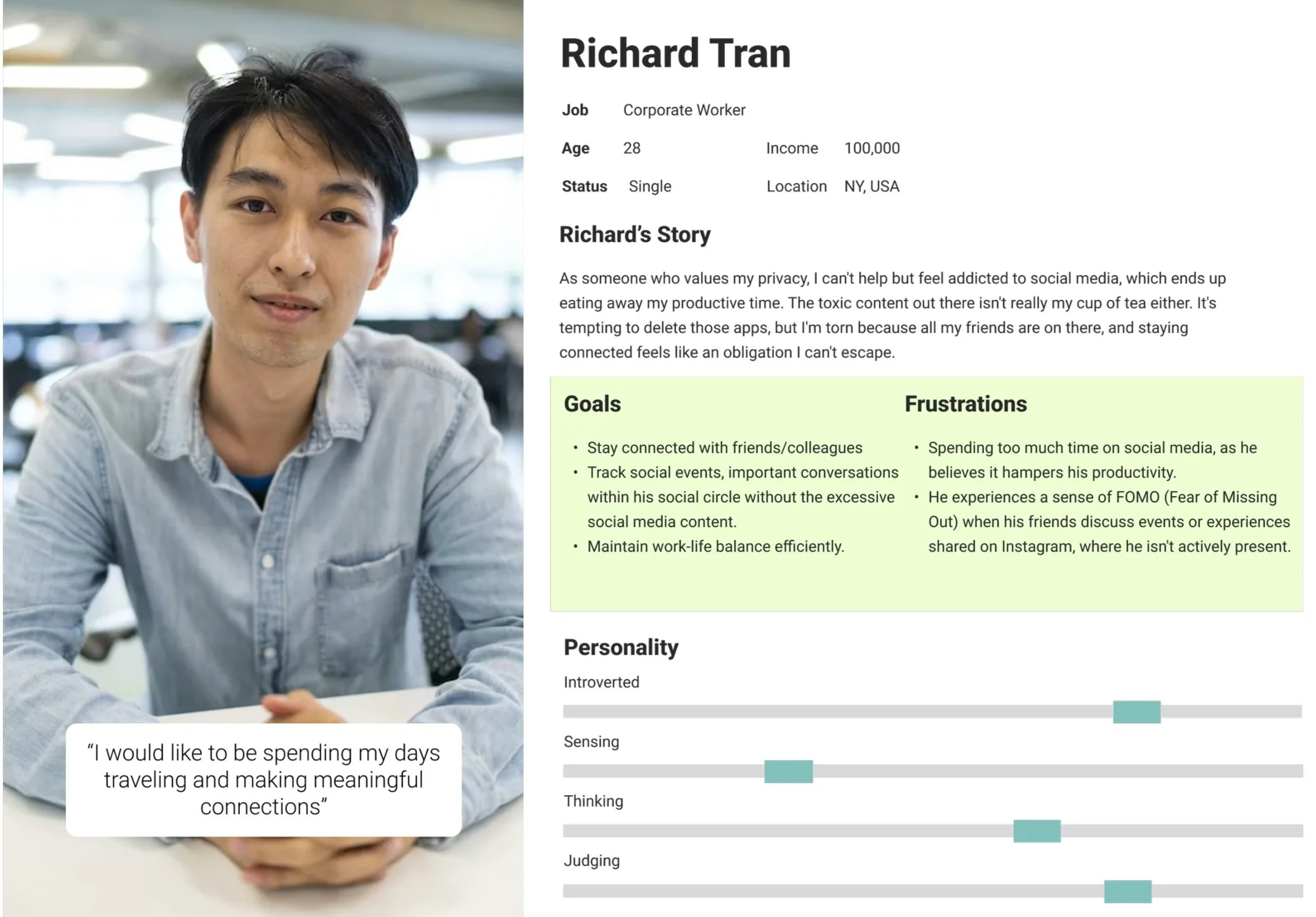
User Persona:
HMW design the app in a way that is intuitive
HMW design the app that limits distractions?
Solution: Keep the design the similar to Instagram for familiarity.
Solution: Integrate focused mode for minimal distractions.
I selected this persona to represent the typical working individual seeking to boost productivity while maintaining connections with friends. The aim is to provide a platform free from distractions like doom scrolling and ads, catering to those who value both efficiency and meaningful social interactions.
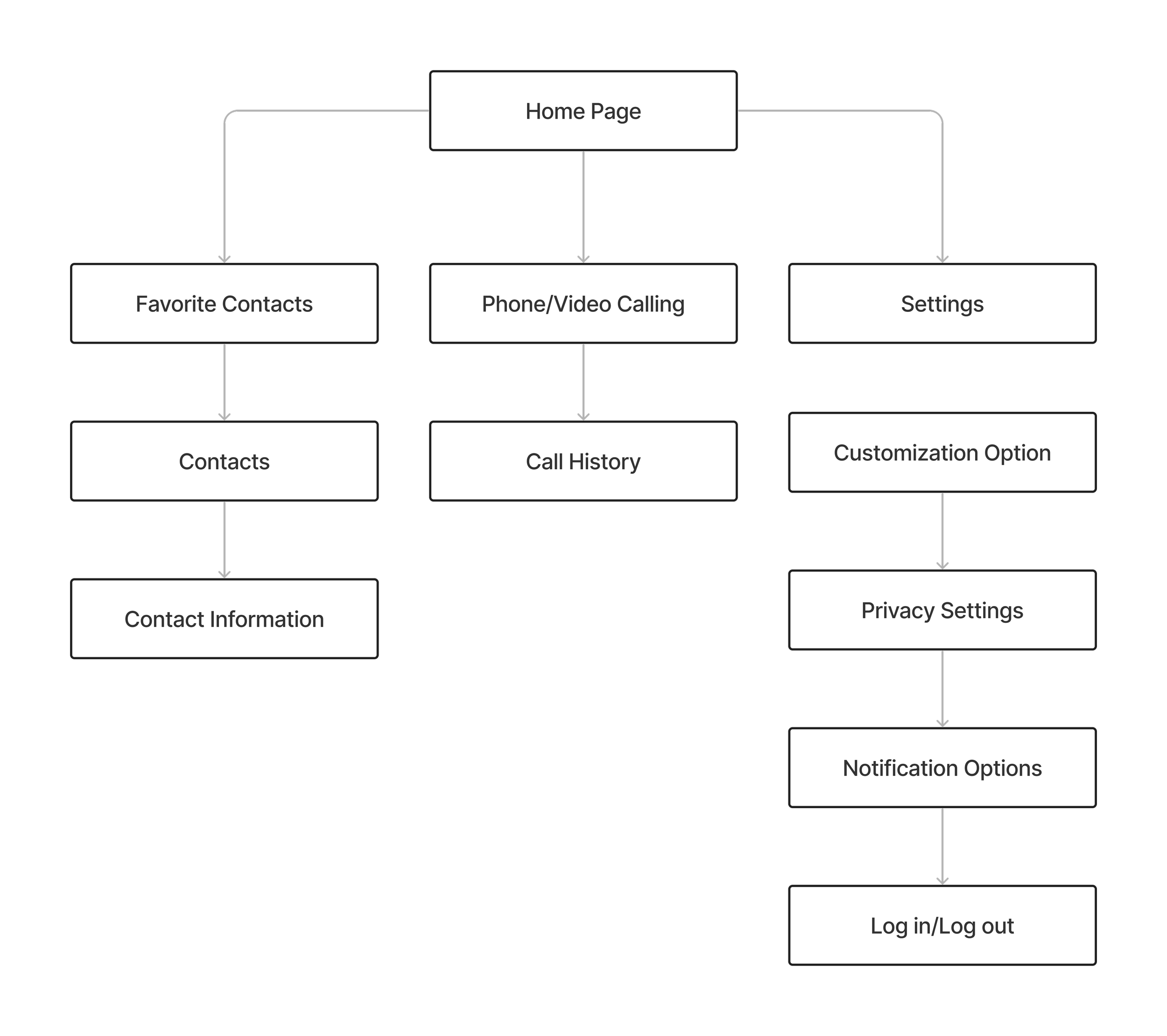
Site Map:
Information Architecture
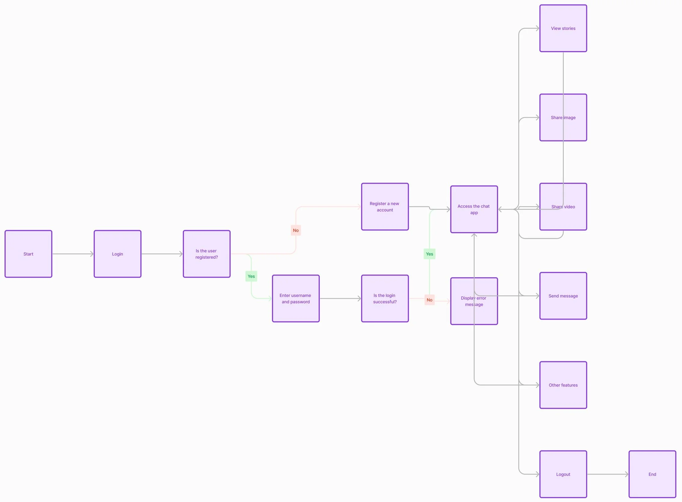
Organizing information is crucial for helping users find their way around the app and enhancing user satisfaction. I made this task flow for new users.
Ideate
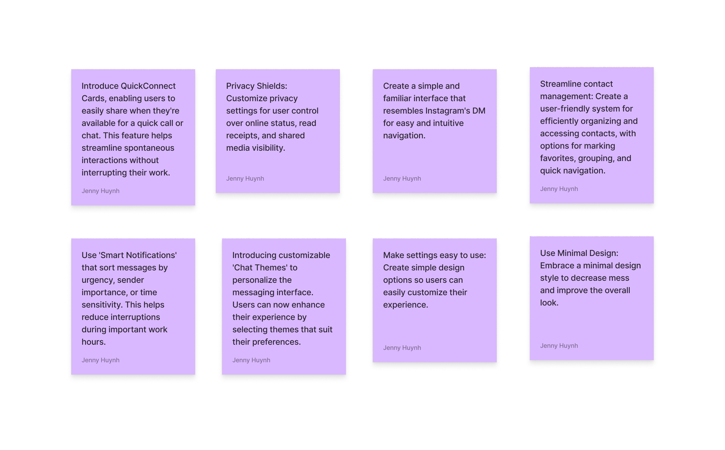
Brainstorming Session:
I swiftly generated numerous innovative ideas for additional app features and elements in order to address queries such as "how might we create a user-friendly app with minimal distractions."
Wireframe Exploration
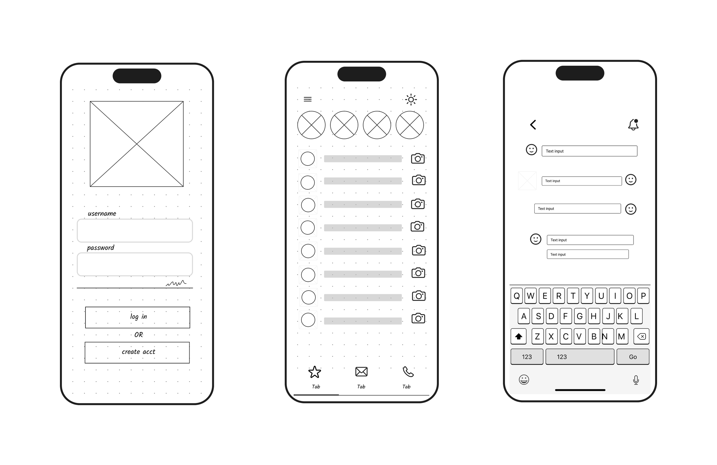
sign insign inLow Fidelity Wireframe:
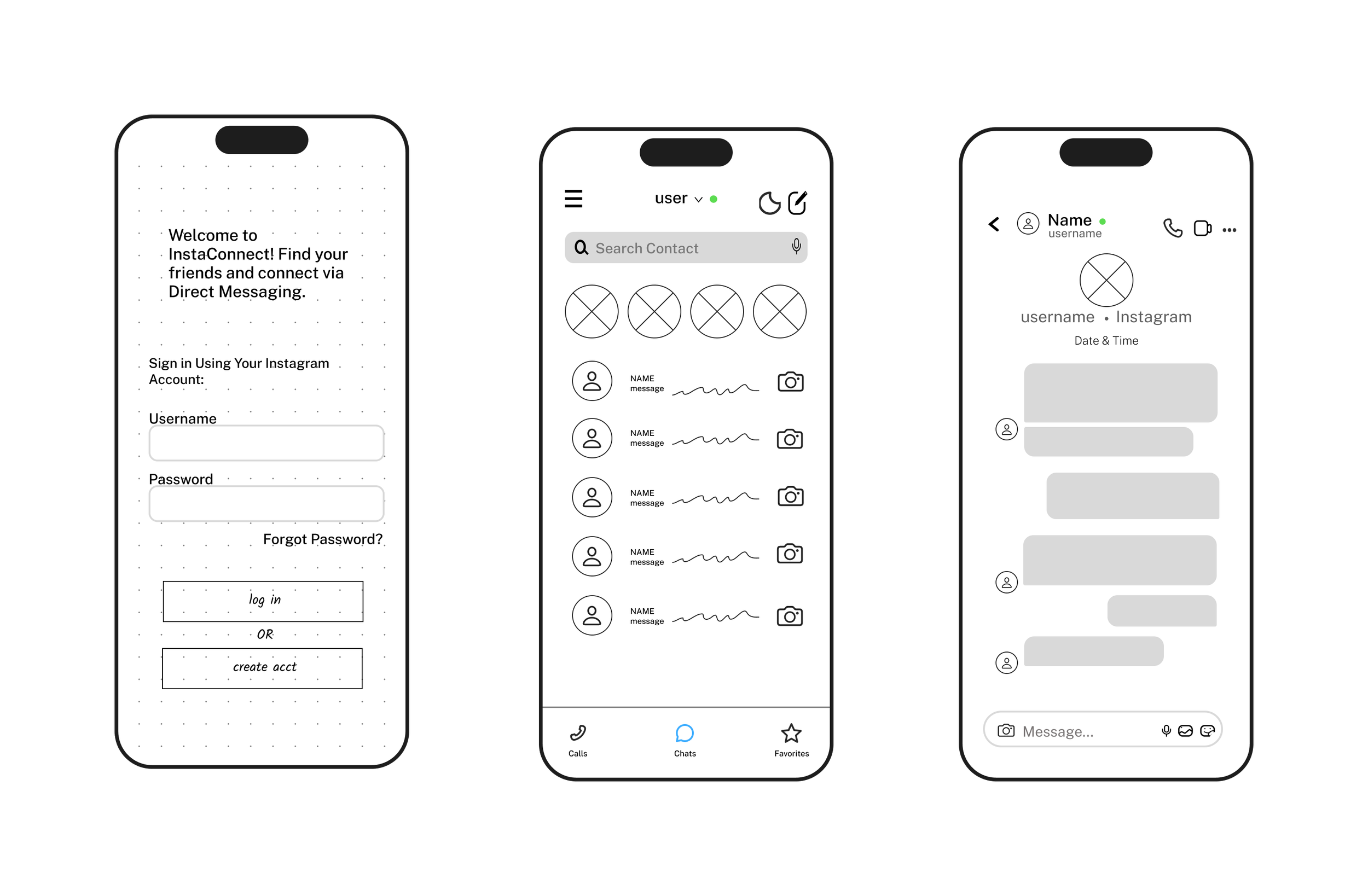
home pagemessagingMedium Fidelity Wireframe:
home pagemessagingmessagingI created simple wireframe sketches that resemble Instagram's direct messaging to highlight the app's ease of use.
For the medium fidelity wireframe, I included additional elements to highlight the design further.
Prototype & Testing
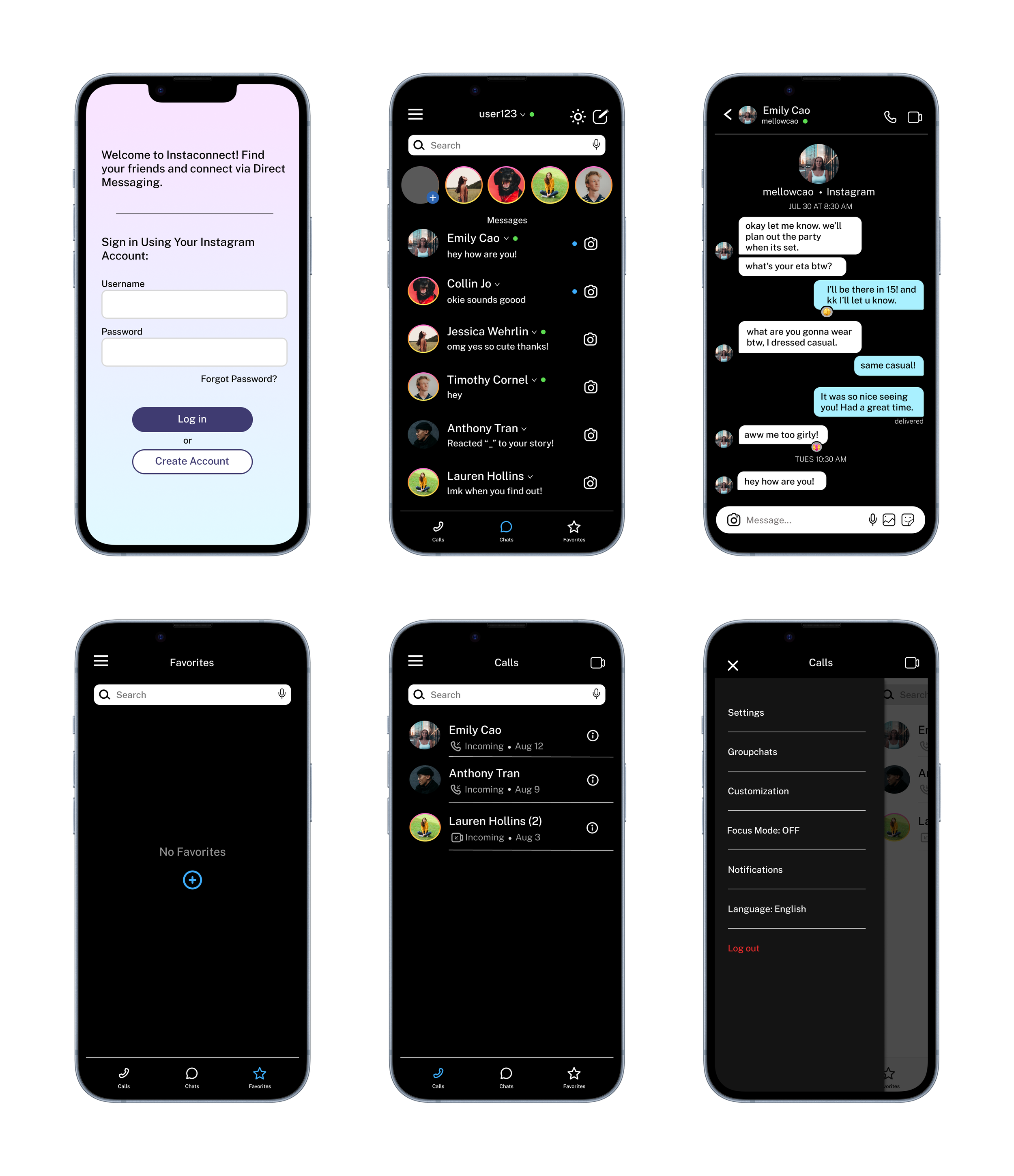
The final design resembles Instagram's messaging, with both light and dark modes. I've also incorporated additional features. Below is the clickable prototype to begin testing.
High Fidelity Wireframe:
sign infavorite pagePrototype:
Usability Test Results:
I tried out the initial version with 5 users to find out what needs to be improved for better usability and user satisfaction. They had to sign up, send a message, and tell me if they found the app easy to use and understood its purpose. Here are the results:
100% tasks completed.
100% of users could explain what the product was.
100% found it intuitive.
Issues discovered during testing and addressed in the update:
Some users had difficulty clicking on specific areas.
Update: Enlarged clickable areas for easier access.
Users requested the ability to close the hamburger menu by clicking on it again and when navigating to other pages.
Update: Addressed the hamburger menu functionality.
home pagecall pagemessagingsettingsKey Lesson
Prioritize User Understanding, Simplicity, and Usefulness.
When designing, I learned how important it is to prioritize easy-to-use and helpful features that truly enhance the user experience. Additionally, getting user feedback is crucial for creating better experiences, as it provides valuable insights that can guide iterative improvements. There's always a way to enhance someone's experience and keep making impactful changes as needed to ensure continuous enhancement.