

Vera
End-to-end app for beauty shoppers
My Role: UX/UI Designer
Time: 2023
Background
I began this project to address impulsive buying in the beauty industry. As a consumer, I observed heavy reliance on user reviews while neglecting product ingredients. Recognizing a lack of motivation for research, I aim to promote wiser beauty product purchases.
Goals
Creating an end-to-end application that provides ingredient info, allergen warnings, and user reviews to help users make smart decisions, avoid impulse purchases, and improve product safety awareness.
The Problem
Beauty industry customers often make impulse purchases based on user reviews instead of researching product ingredients, which can be risky. This lack of thorough research continues the cycle of impulsive buying and prevents informed decisions about beauty products.
My Impact
For this project, I confirmed the demand for the initial product idea and used research data to develop a complete product as the sole designer.
Research
Below are areas I want to explore in user research:
-
Explore how users depend on reviews and their preferences in seeking beauty information.
-
Understand where users prefer to find information about beauty product ingredients.
-
Look into challenges users face in research, their safety awareness, and what motivates them to change behavior.
Methodologies
I gathered user feedback through surveys, interviews, and competitive analysis to understand product preferences, information-seeking habits, and problems.
Competitive Analysis
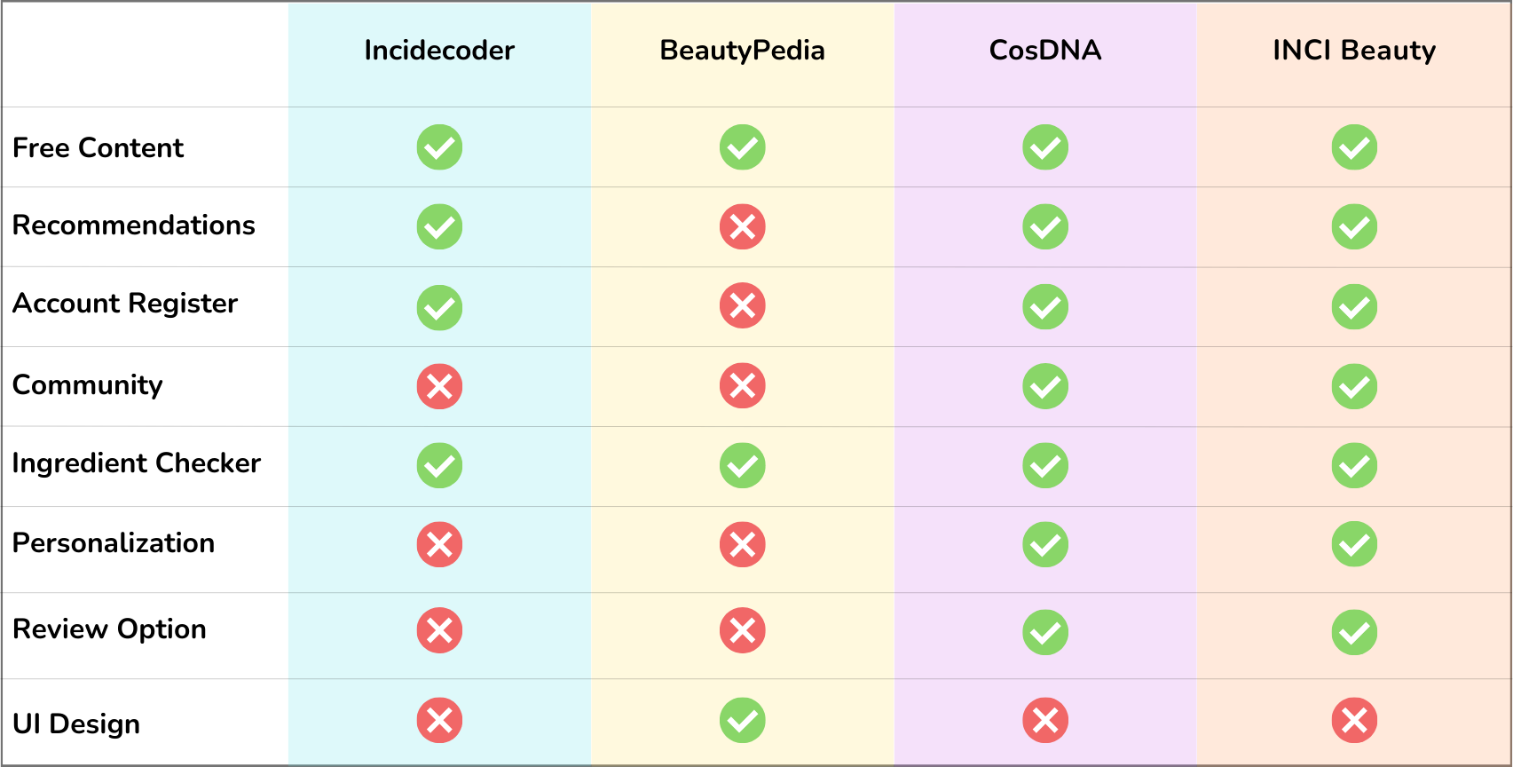
During this project phase, I reviewed various apps and websites for analyzing cosmetics. I found that while some apps come close, none of them have everything needed. Unfortunately, the ones that come close have a poorly designed interface that is not user-friendly. In designing Vera, I aim to create a user interface that is fast and easy to use, so that users don't have to deal with an overwhelming amount of messy information.
User Interviews
I talked to 3 people to understand how they shop for beauty products and what problems they encounter.
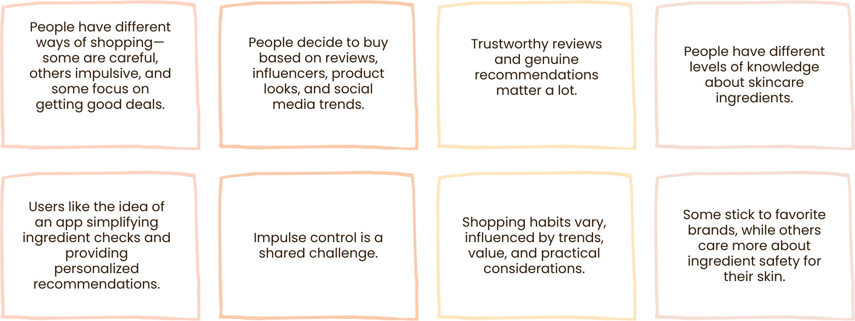
Based on interviews, I found that most beauty buyers are influenced by other people's product reviews more than the ingredients. Buyers rely on others' experiences to decide what to buy, even if they don't fully understand the product. This shows the need to help users make informed decisions before purchasing, for long-term success. For full interview click here.
User Surveys
I made a survey to gauge the importance of product ingredients and people's comfort with researching and understanding them. For full survey click here:
63.6%
54.5%
70%
User Persona
are of 18-26 years of age.
struggle with reading skincare labels.
are willing to research skincare products before purchase.
After I organized the research findings into the affinity map, I used them to make a persona for the main user group.
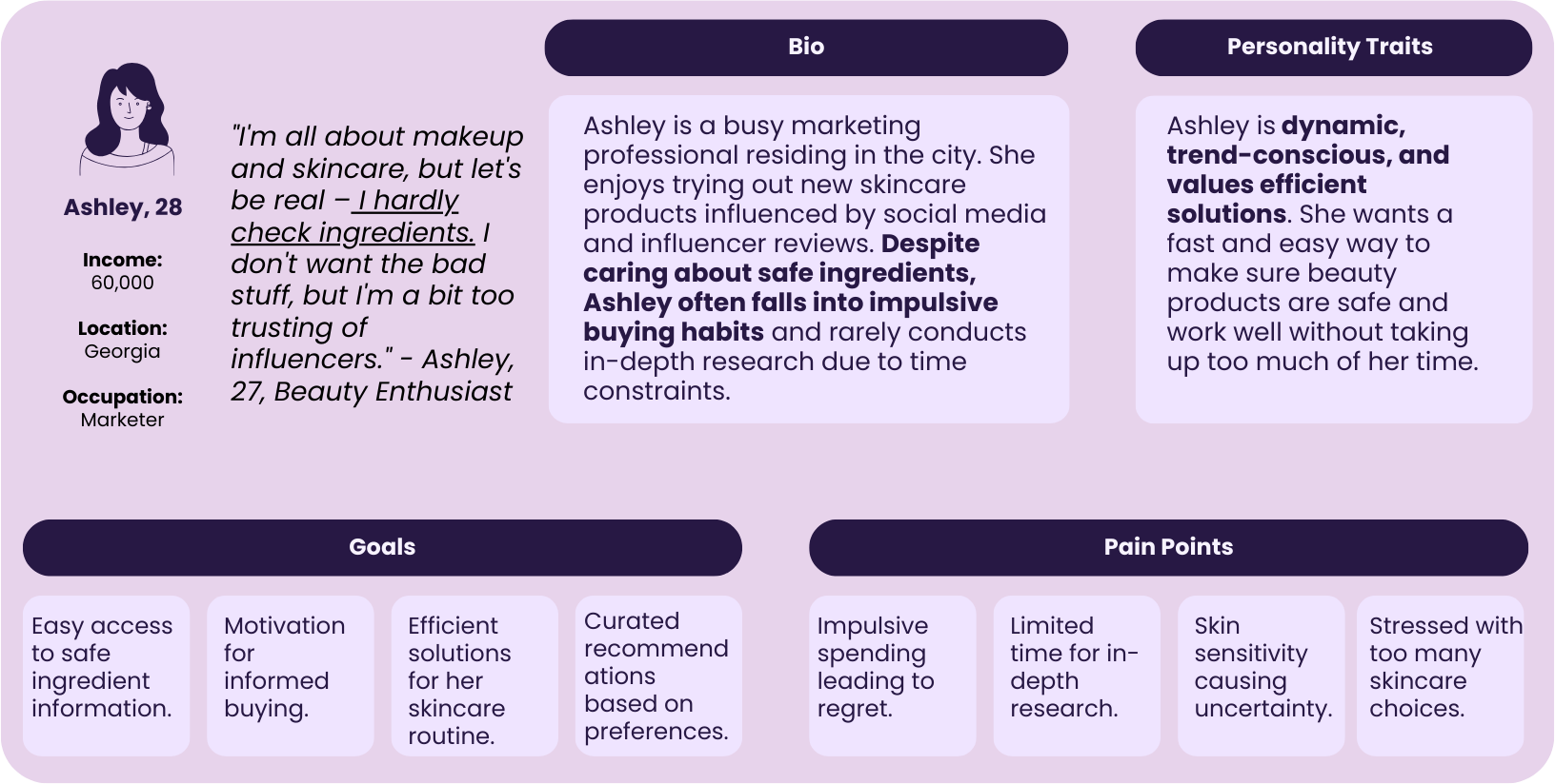
Relevance to the Project:
Ashley's persona represents the target audience's beauty product choices. Her pain points align with addressing pre-purchase decision challenges.
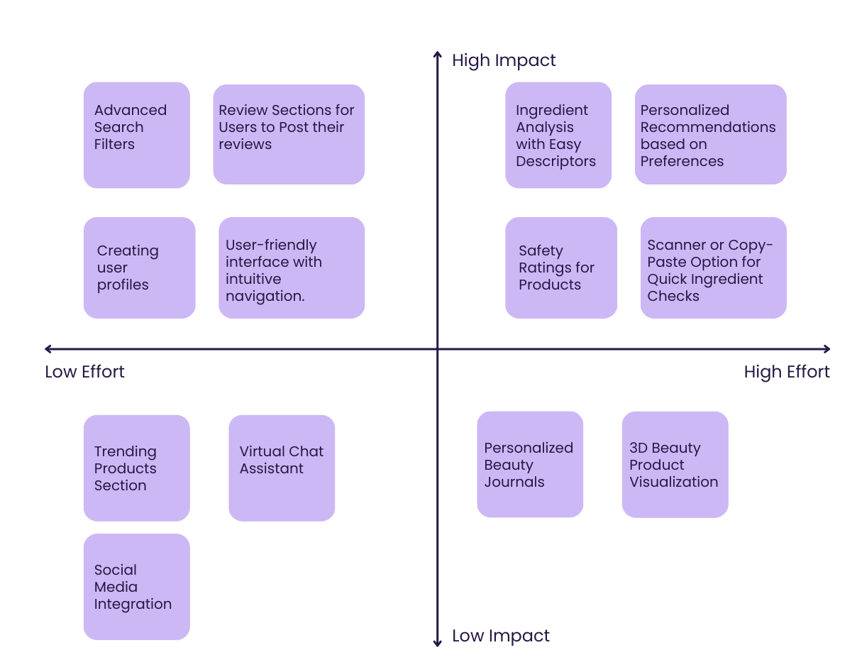
Ideation
Feature Prioritization
After identifying the best solution for users, I brainstormed features for the user-friendly shopping app based on research findings to ensure high value for users. Features include a simple interface, smooth onboarding, and quick access to main functionality.
Task Flows
After outlining the app's features, I made workflows for the key tasks.
Simple User Flow:
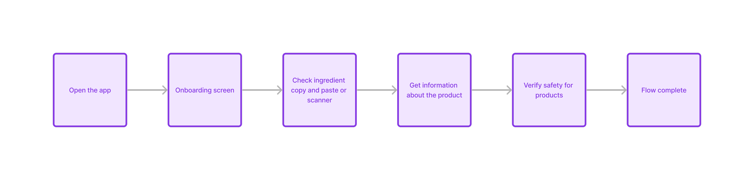
Task: Analyze a beauty product:
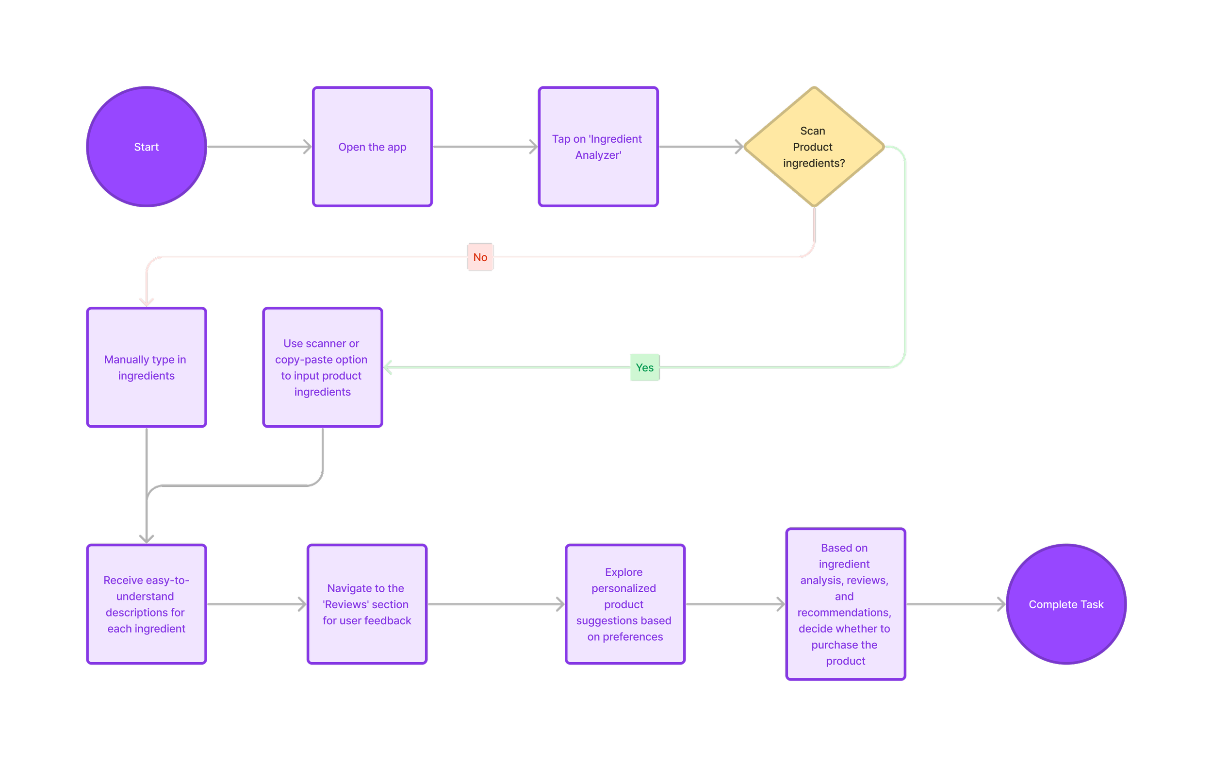
The flow chart simplifies analyzing beauty product ingredients by scanning and entering them manually. It includes ingredient analysis, reviews, and personalized recommendations to improve user experience.
Key Takeaways:
User preferences for beauty product ingredient analysis vary, requiring scanning and manual entry.
Reviews and personalized recommendations improve decision-making.
Opportunities:
Keep improving ingredient database.
Continuously improve the user interface for an easy and simple experience.
UI Kit
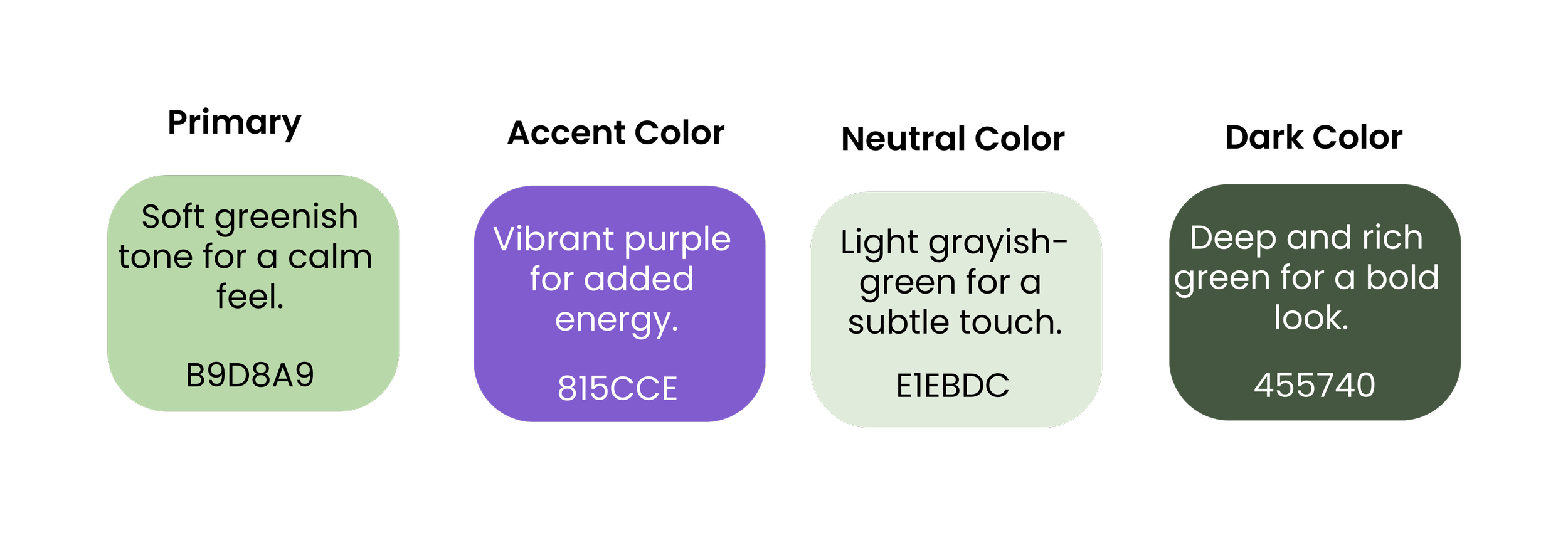
Brand Adjectives: elegant, warm, secure, reliable, friendly
Color Palette:
Creating the UI kit for Vera I wanted the interface to be warm, attractive, and easy to use, while still looking professional. For the typography, I primarily used the font Poppins, but for reading information, I chose Times New Roman as it's easier on the eyes. To add a touch of elegance to the titles, I used the font East Botany.

Typography:
Logo:
Buttons:
Icons:
Since green represents reliability and warmth, I wanted to use a lot of green shades along with neutral colors because they go well together. I also chose purple as an accent color for headers and buttons because it symbolizes elegance.
Low Fidelity Wireframes
I wanted to make a basic wireframe that's easy to understand and includes all the important info about the brand, its values, and its helpful features.
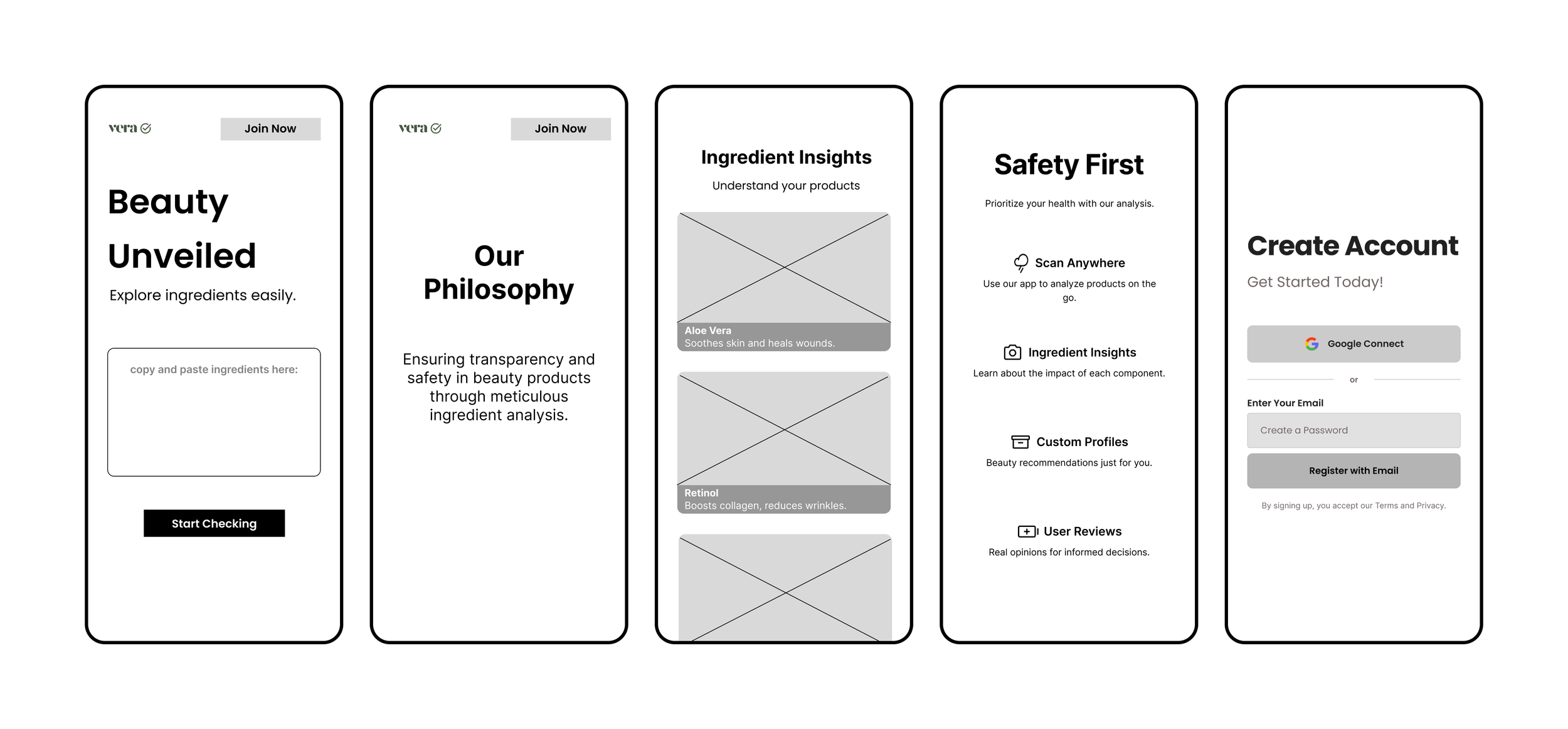
High Fidelity Wireframes
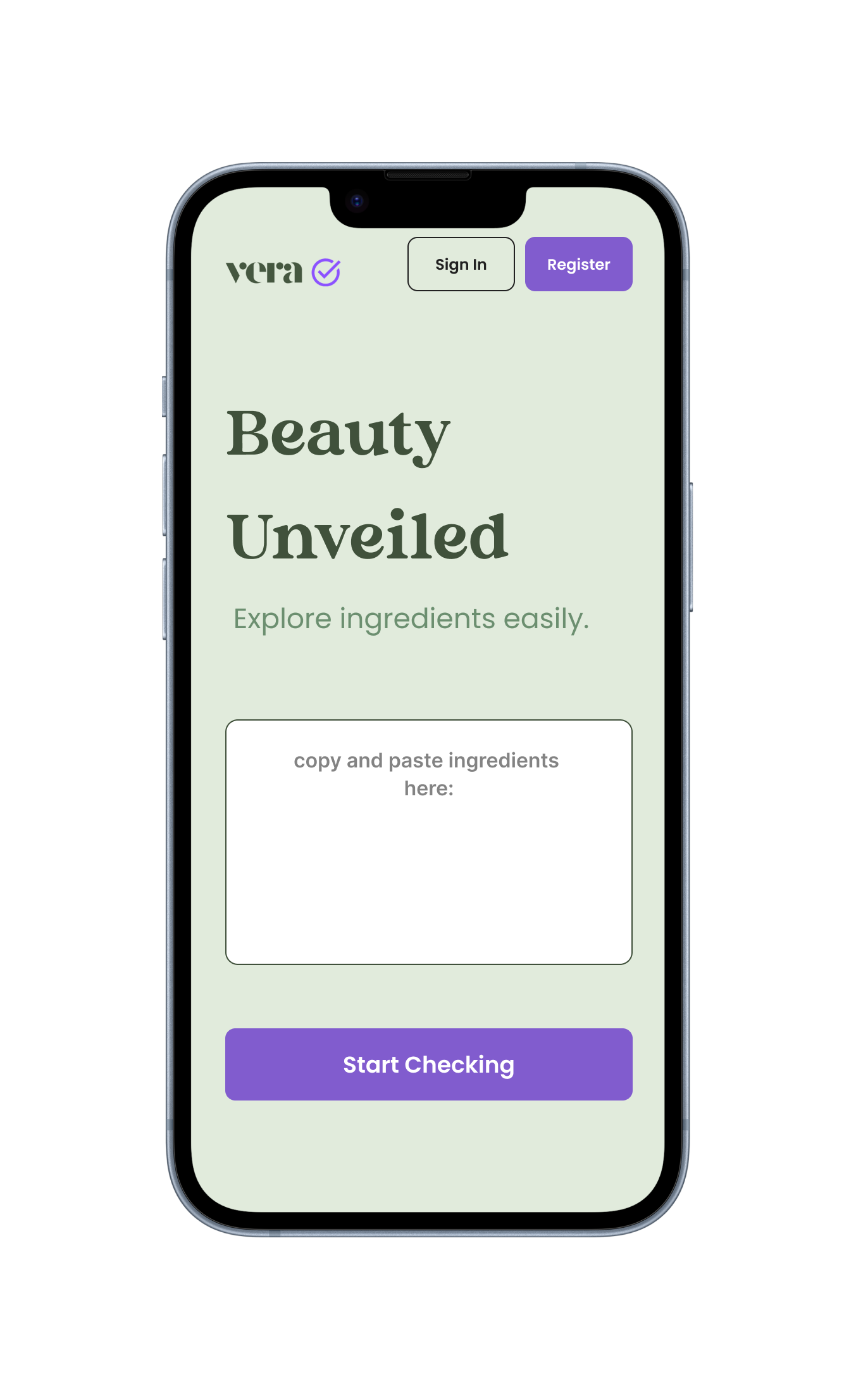
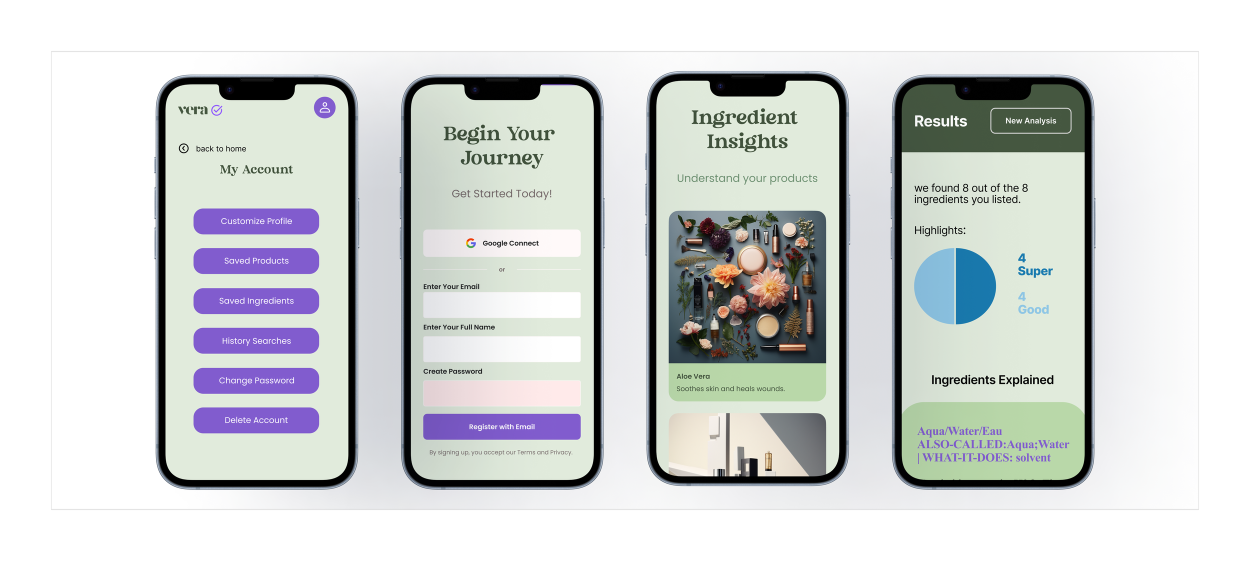
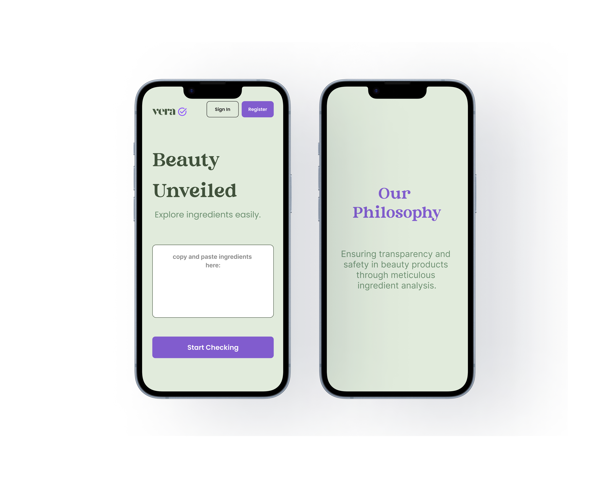
In the detailed wireframe, I aimed to ensure the app was easy to use with few colors. That's why I chose a green color scheme with a touch of purple.
I designed screens for the homepage, brand information, account registration, and ingredient details.
Prototype
Usability Tests Results
I tested the first prototype with 4 users to see what improvements are needed to make it simpler and more fun to use. They searched for ingredients, made a profile, and I also asked if they understood the app's goal. Here's what I learned:
100% felt the design was intuitive
100% could state the brand’s goal
100% of users completed their tasks
Issues discovered during testing and addressed in the update:
Some users had difficulty clicking on specific areas.
Update: Enlarged clickable areas for easier access.
Users wanted a back button for some pages
Update: Added the back buttons
Users would have liked a label at the navigation bar for home.
Update: Added a home icon
Key Lesson
Research is vital for app impact. Branding and language shape audience perception.
I learned that doing research is important to understand how your app affects things. Using clear branding and language is vital for good communication. And the impact of the project is about the effect a design has on its audience, creating a strong and lasting impression.